Choosing colours

Colour! It seems so simple, but it’s a very delicate matter. Colours change frequently with the fashion trends, but also make a statement about your own personal taste.

Second only to the weather, colour may well be one of the most important factors that can affect your emotional state. Colours can determine the atmosphere and mood in your home, so it’s important to choose your colours carefully to ensure your home ends up the way you want it to look!

A well-chosen colour is in harmony with the other colours in your home, such as floors and interior design elements, and suits the room and how you use it. Colours can highlight the best features of your home, or distract from the less beautiful details.

Effects of different colours

What are the effects of different colours? Red is known to stimulate the appetite. That’s why you often see red in restaurants. In your own home, red would be a great colour for your dining area. Red also brings warmth into your home and can add a cosy to the living room. Please note that red can be quite a dominant colour, so it’s advisable to have just a touch of red in your home.   

Orange or yellow add dynamic energy to your home, just like the sun. These colours are great for rooms that don’t get much light. Just like the colour red, yellow and orange can add a cosy note.

Blue, on the other hand, brings peace and serenity to your home. That makes it ideal for bedrooms, but blue is also a good colour for a study or home office. Because blue also feels cool, the colour is used more often in southern countries.

Just like blue, green offers a sense of rest and relaxation. It provides a natural feeling and can have a calming effect.  Great for bedrooms and bathrooms.

Colour and space

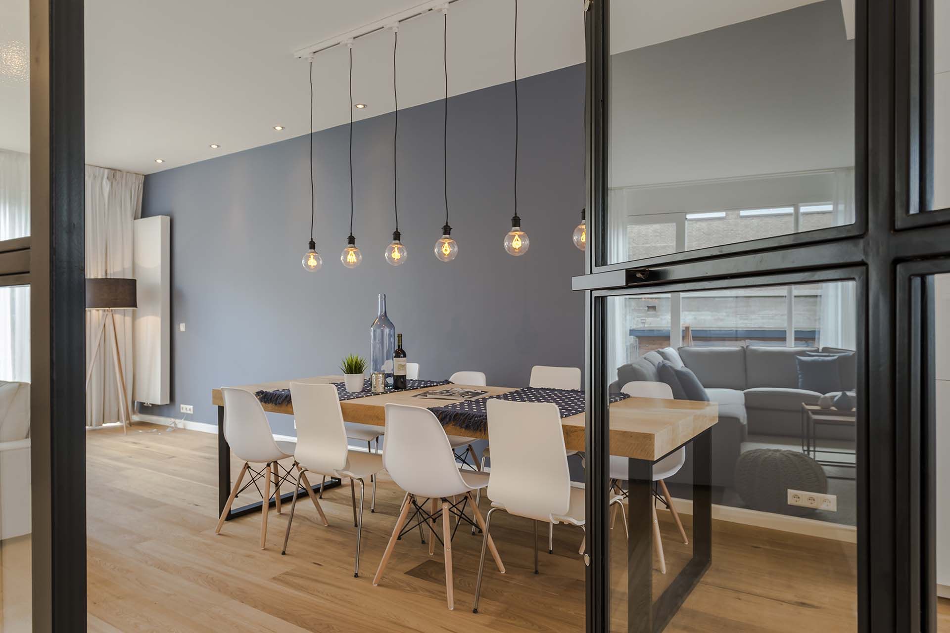
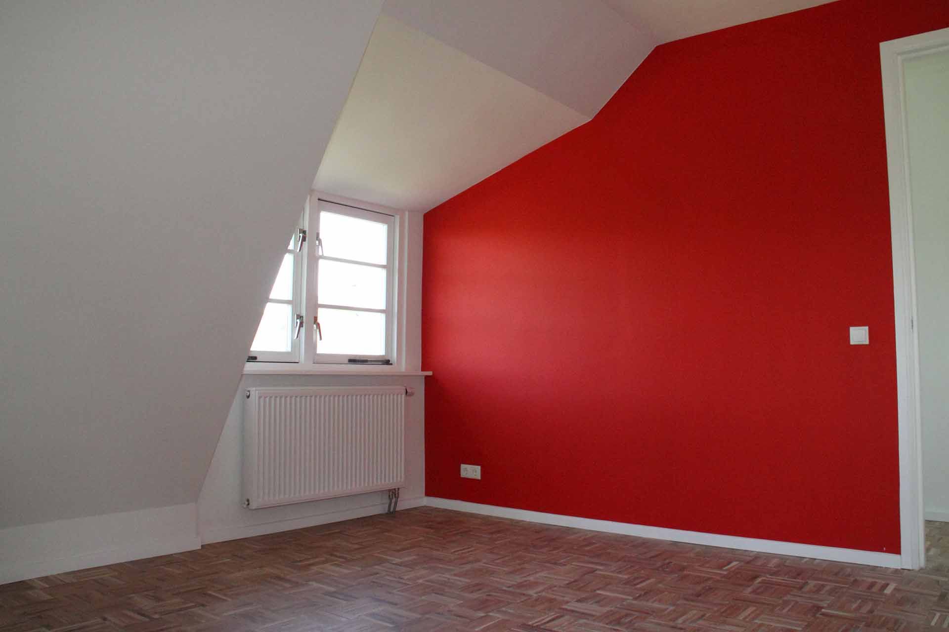
Besides the fact that colours are great for defining an atmosphere, colours can also have a major influence on determining a sense of space. In general, light, pale colours make a room seem larger. Bright or dark colours, on the other hand, make the space seem smaller. However, it’s worth noting that this isn’t always the case. People are generally inclined to paint the walls white in a dark room, hoping that the room will feel lighter – But that doesn’t always achieve the intended result. White walls in a dark room often look grey, which makes the room feel chilly and unwelcoming. It is better to use warm colours in a dark room, such as red and light yellow.

Looking for photos about how to use colours in your own home? Check out www.flexa.nl for inspiration.  The site showcases lots of different interiors in all sorts of colour palettes. See what suits you best!

Contact

Let us come up with a cost estimate, free of charge...
…and allow us to amaze you!

Request an appointment now, free of charge:

We have the lowest prices in the market and offer the best possible quality, guaranteed! We will come by to visit your location and estimate the costs free of charge. All information you provide will be kept strictly private and will never be shared with third parties. More than 50% of our projects come from referrals through satisfied customers, both past and present. We can offer more than 1000 references throughout the Netherlands.

We look forward to working with you as well! Together, we will make your dream come true.

We would be happy to come visit your location and estimate the costs, free of charge.
We will contact you within 24 hours.

Novo on social media

E-mail your preferences

We prefer to communicate by email; that keeps costs low. We always respond within 1 working day.

Request a viewing

Request a viewing. We will come by to make a cost estimate, free of charge.

Office & Showroom

Heivlinderweg 61
1113 LS Diemen
KvK 34371241
Bouwend Nederland 845066
E-mail: info@novobouw.nl